Overview
Cepsa is one of Spain’s largest industrial organisations and has been operating successfully for over 80 years. Today, the business is a major player in the global energy market.
To help prepare the brand for the next phase, we sought to define its essence. We pinpointed two essential aspects: that the brand is both highly technical and service orientated. We encapsulated these seemingly disparate ideas in the single cohesive thought, ‘Adaptable Energeering.’
Our collaborative work for Cepsa has received an IALD Award for Excellence & Sustainability.
Reinventing the service experience
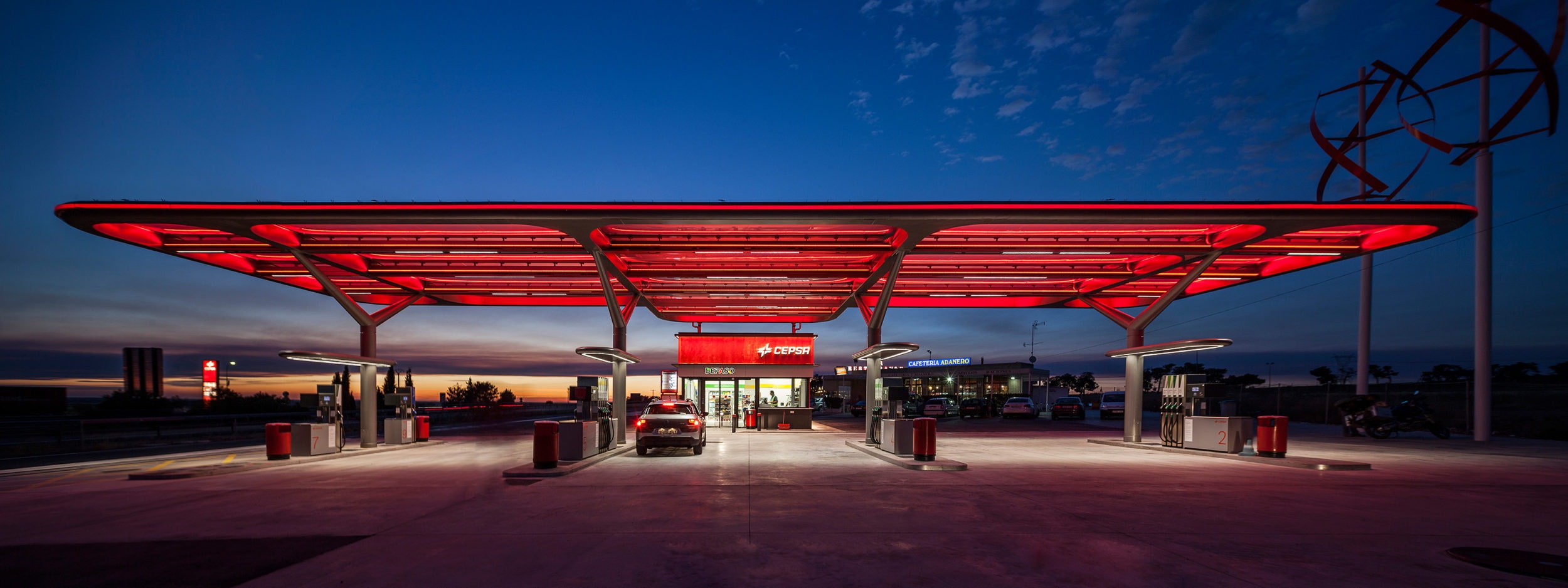
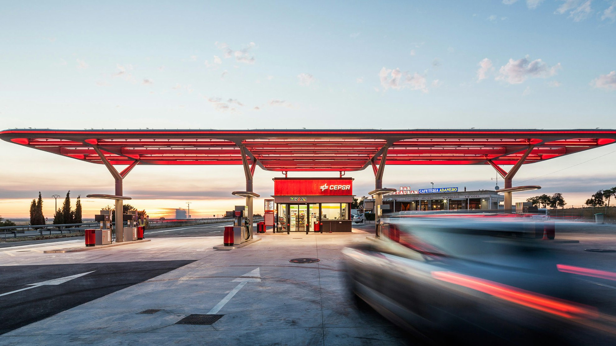
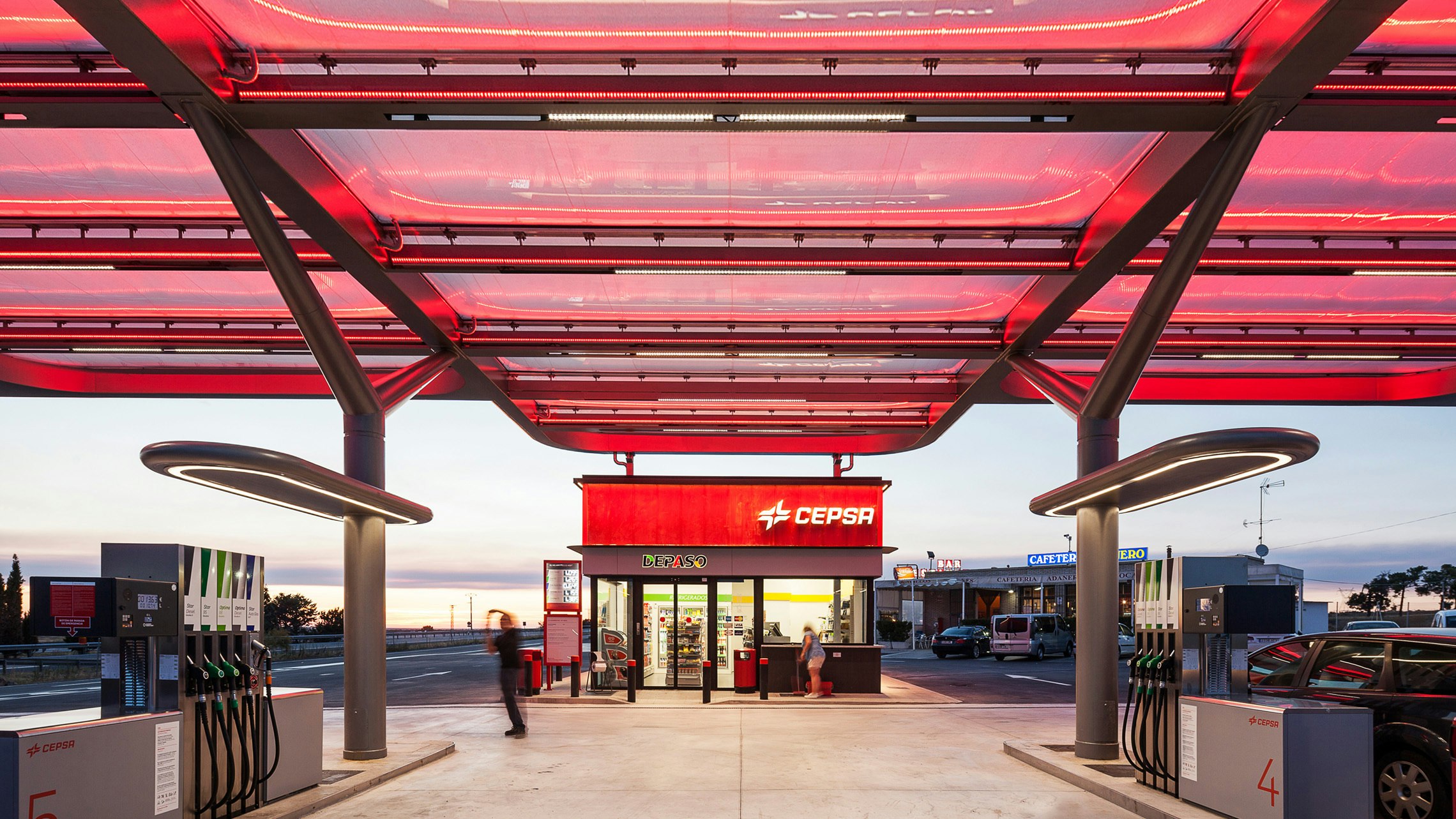
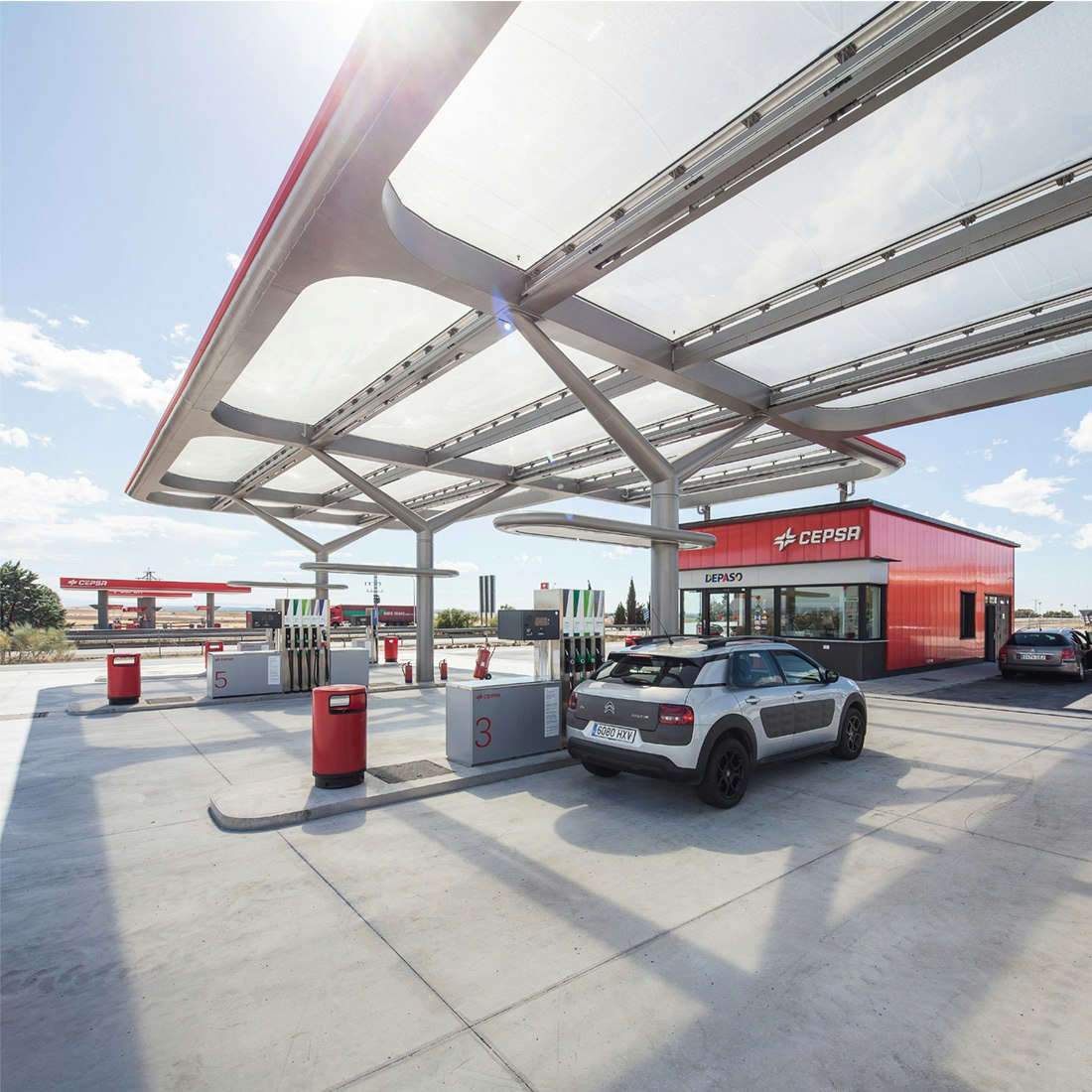
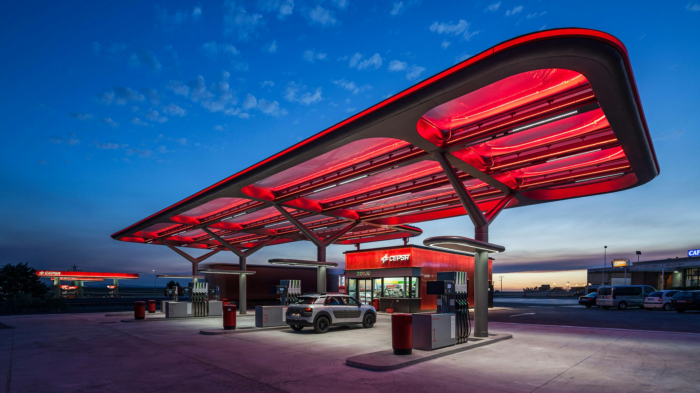
The next challenge was how to communicate this new proposition most effectively. We identified that, despite the company’s scale and scope, its petrol stations remain the crucial touchpoint that connects the brand with the world. This discovery led us to create an all new service station concept that would improve the experience, take advantage of the latest technology, create visual impact and represent Cepsa in a fresh and meaningful way.
Working alongside our design partners Malka & Portús and Tangerine, we rethought every aspect of the experience, including the canopy, shop, pumps, lighting and signage.
Sustainable design
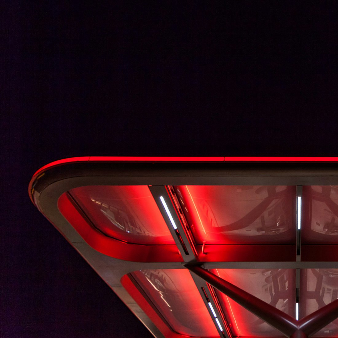
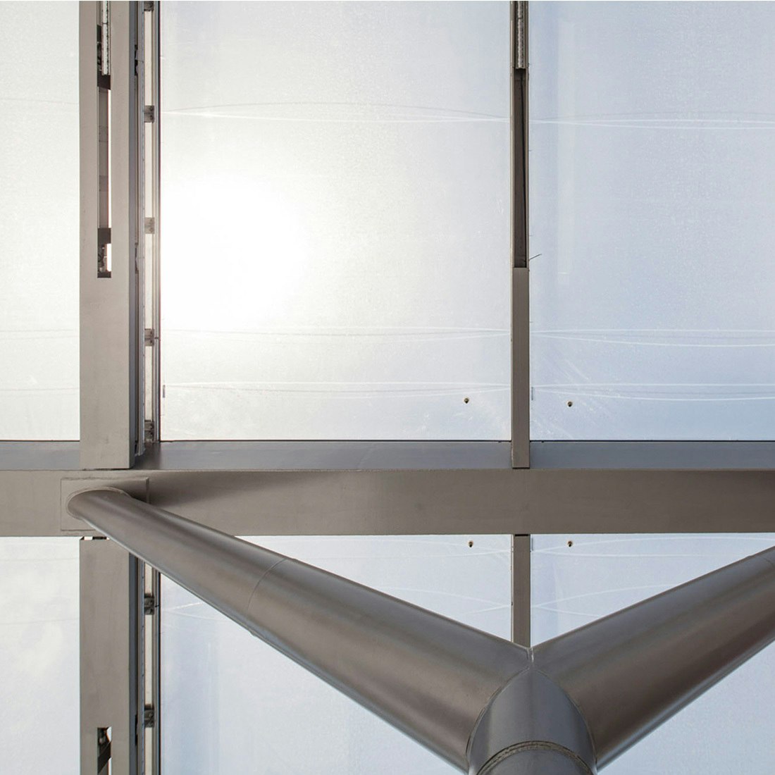
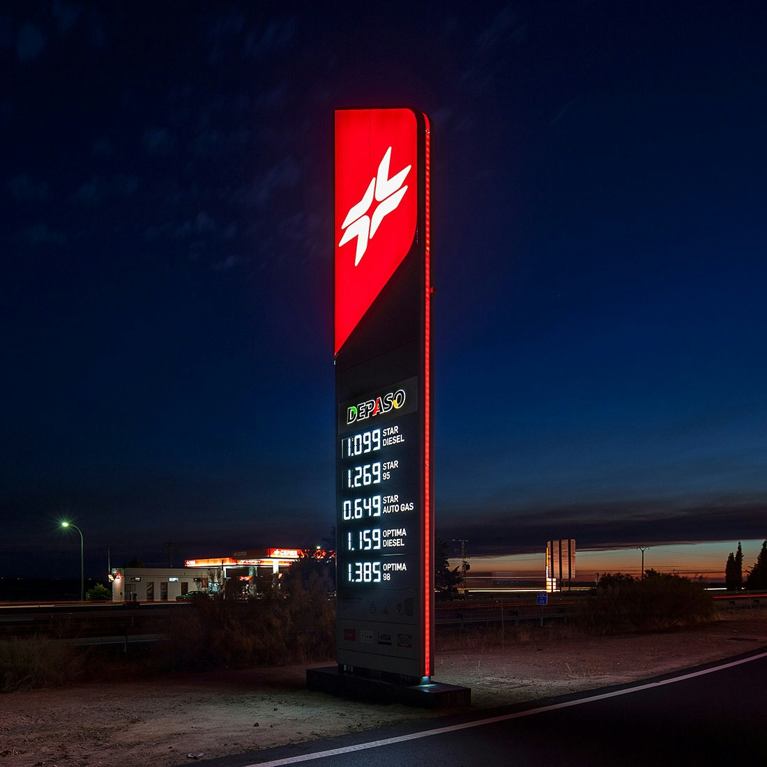
The innovative forecourt canopy design uses a hi-tech ETFE material that is self-cleaning, lightweight and recyclable. Built in a modular way, it’s infinitely adaptable to different station formats. Plus, the material’s 100% transparency reduces the need for artificial lighting, reducing energy usage and costs. The cushion-like forms make the forecourt a soft, friendly environment. At night, illuminated by a red glow, the canopy and shop fascia become jewel-like, creating a welcoming invitation to passing travellers.
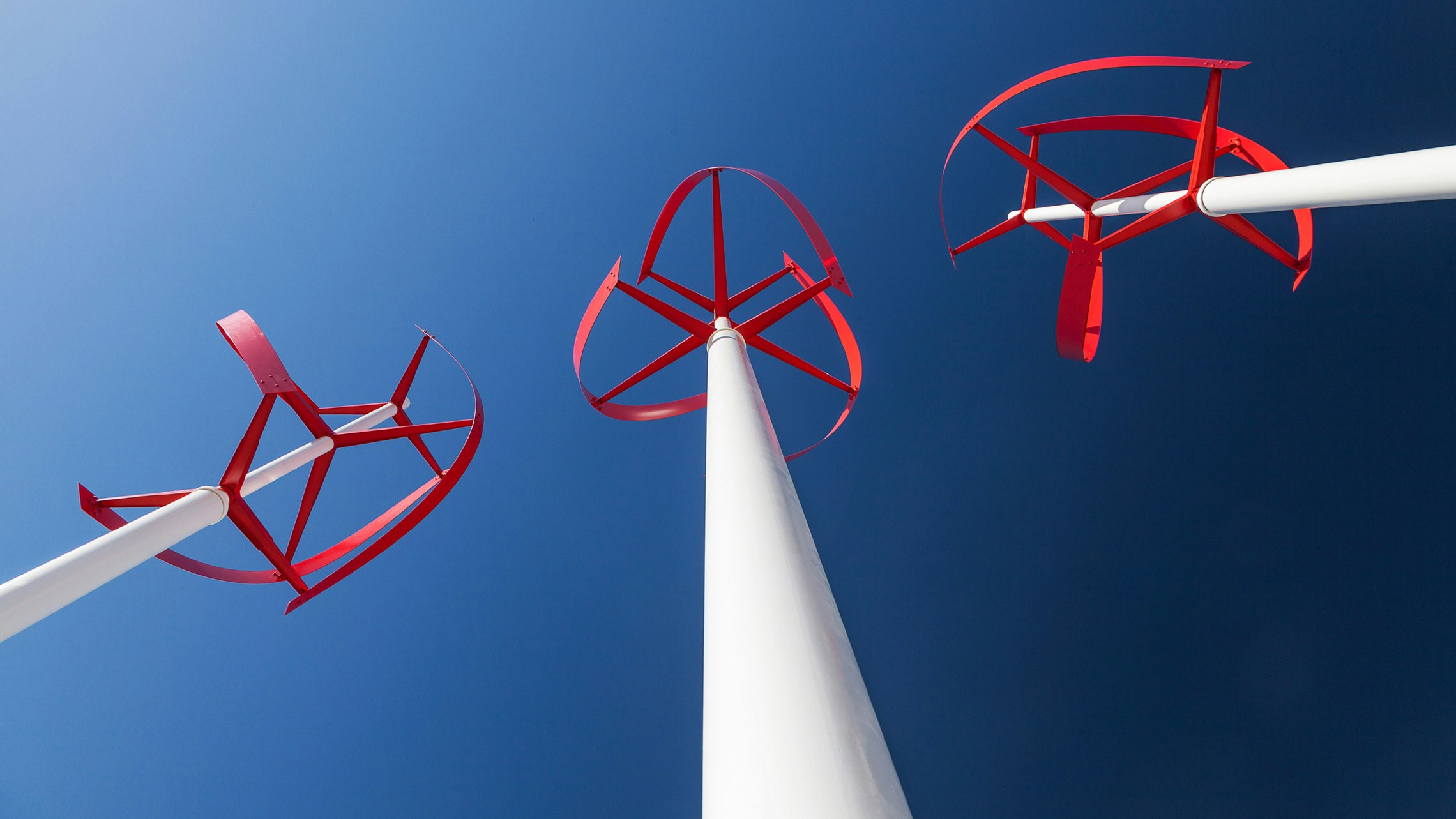
Introducing wind power
While energy consumption of each station is reduced significantly by maximising daylight and using LED lighting, sustainability is helped by a set of on-site wind turbines. Their original, elegant design echoes the organic forms of the canopy.
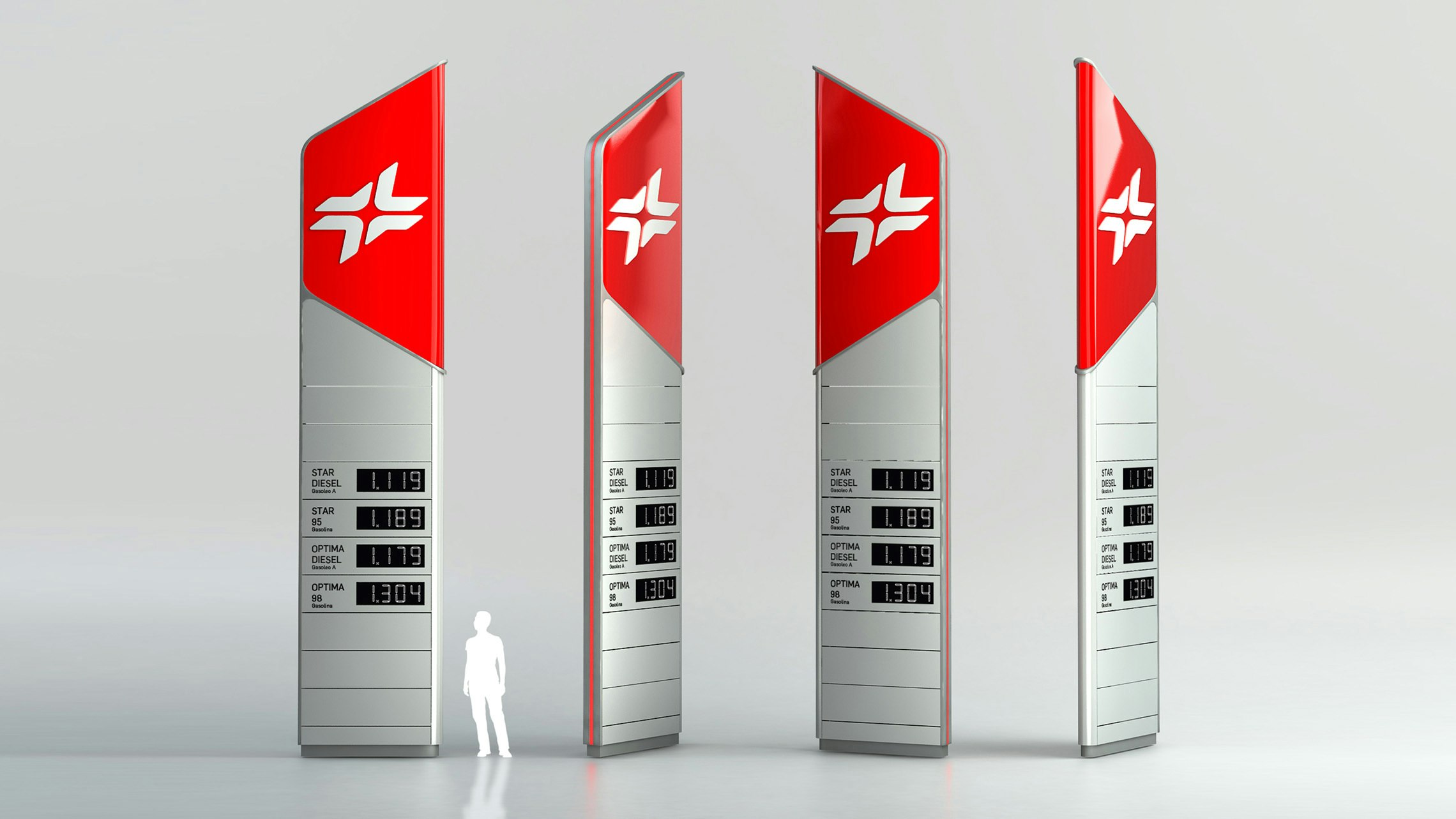
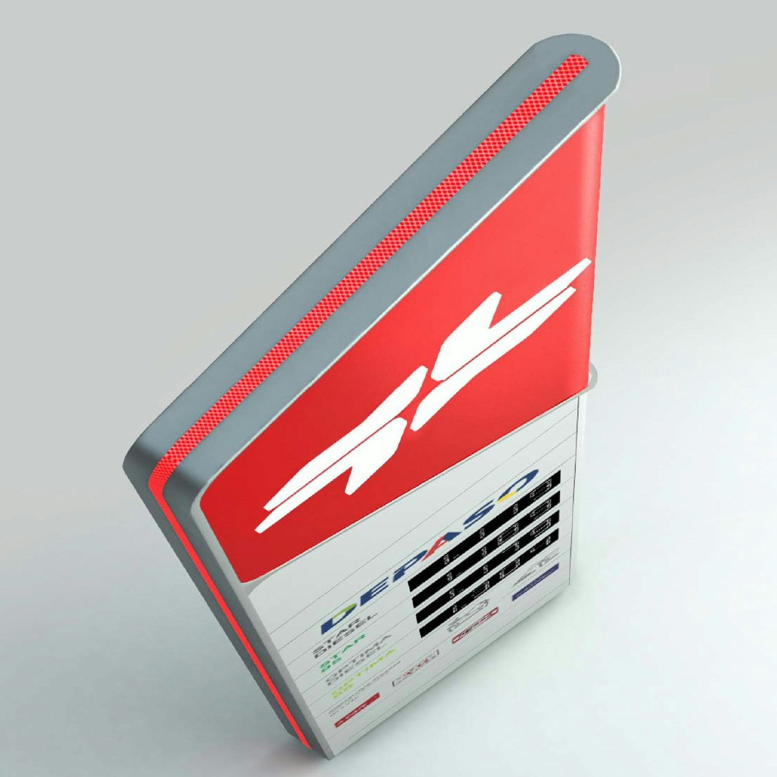
The Adaptable Energeering concept is also apparent in tangible form. The Totem is designed to deconstruct, allowing maintenance to be carried out safely at ground level.
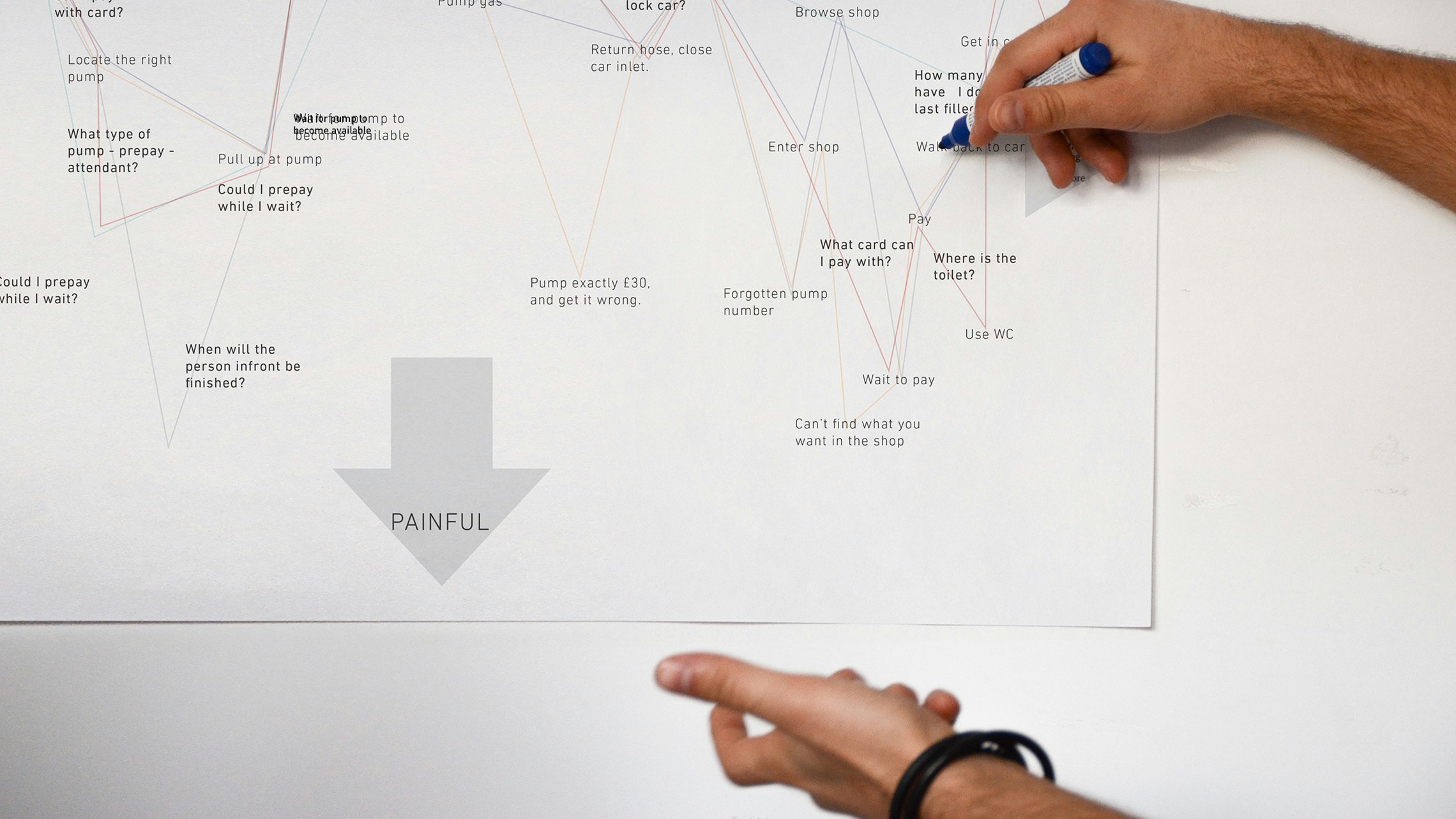
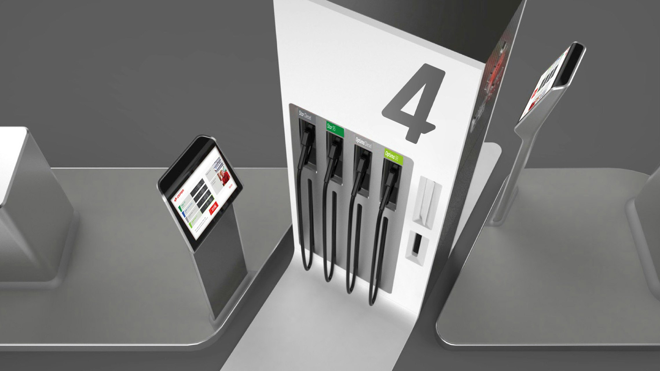
Rethinking the refuelling experience
To further improve the overall user experience, we studied customer interaction with the refuelling island and explored a possible future design vision. Our proposal involves separating the display from the pump, to allow for a more intuitive and natural refuelling operation, and a screen that features a video link with the attendant in store.
The brand flows throughout
In the new Cepsa brand, a single stylistic thread connects every element. For example, the visual identity is inspired by the architecture and vice versa. The bold, rounded forms found in the built structures are reflected in the marque and bespoke typeface.