Overview
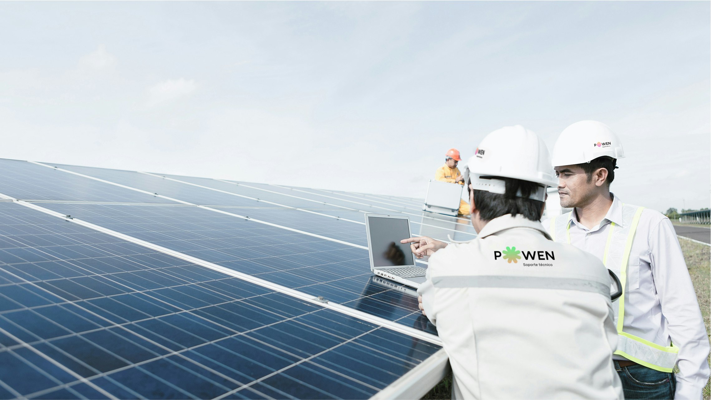
Saffron worked with Fotowatio, a renowned Spanish renewable energy firm, to create a brand that could drive the use of solar energy in Spain and increase consumer understanding of energy consumption. Together we created a new renewable energy brand for the Spanish consumer energy market called Powen.
The new company would focus on solar panel installations for people’s homes and SME’s spaces. But ambitions went beyond those of a clean energy installation company. Our client wanted to educate consumers about their energy usage; something previously neglected in the industry. In addition, they wanted to help consumers understand the value of the energy they use, and the benefits of solar energy generation. Set against the backdrop of a Spanish government with a conflicted energy policy and low renewable targets, Powen aims to drive renewable energy from the ground up.
Taking control of energy usage
A new company with a strong vision required an equally compelling brand strategy and visual language. Saffron focused on the brand’s potential to become a platform to connect people with the subject of clean energy rather than just being a technology vendor. We defined a purpose statement to describe why the brand existed: ‘To help people take control of their energy usage’.
The strategy aims to empower consumers by helping them learn what, when or how they consume energy. In order to transmit the new spirit across the organisation and beyond, we also defined a set of experience principles, a brand personality, Mission and Vision statements – all aligned with the purpose.
Empowering people
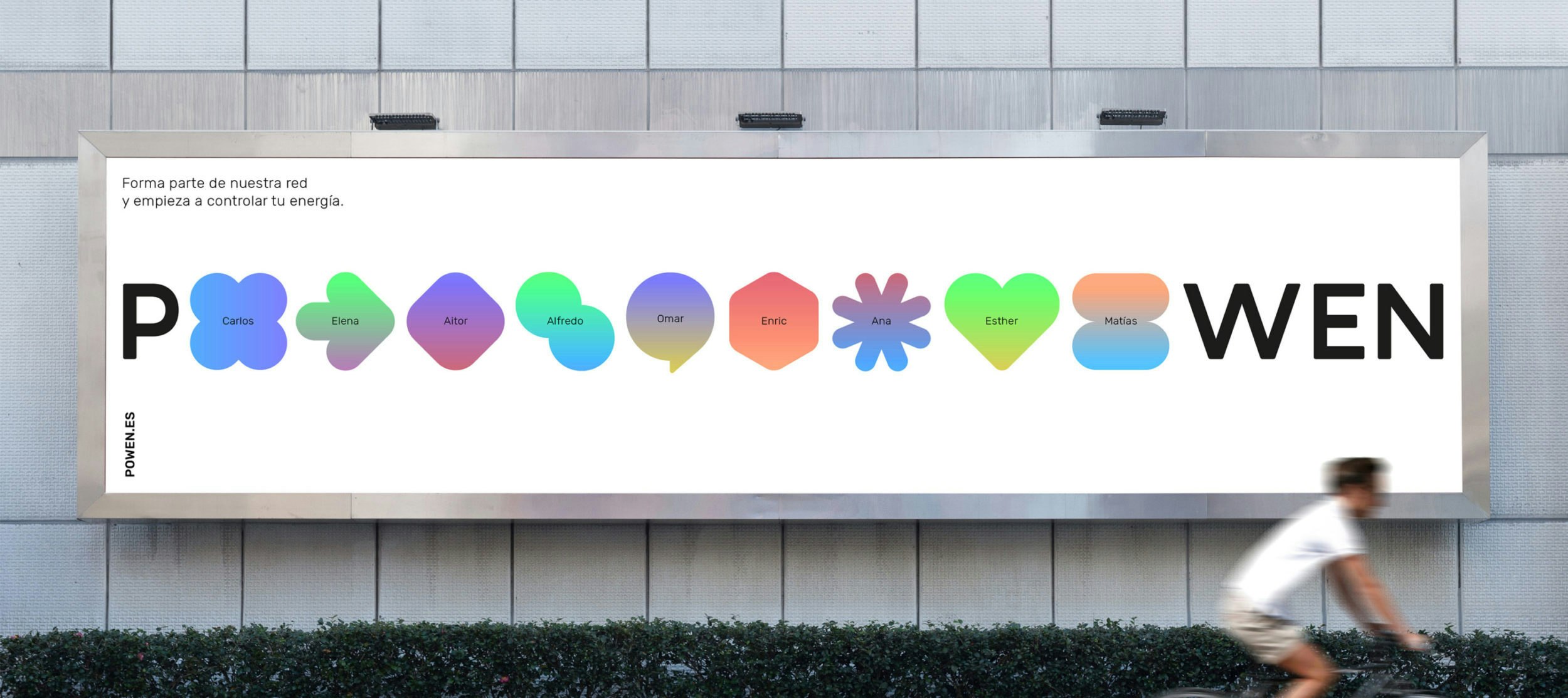
Once the brand strategy had been honed, it became clear there was enormous potential to convey the spirit of the company with a new name. From the idea of ‘give power to the people’ we created POWEN. A name to convey the strength of the principles and mission of the company that simultaneously sounds strong in every market.
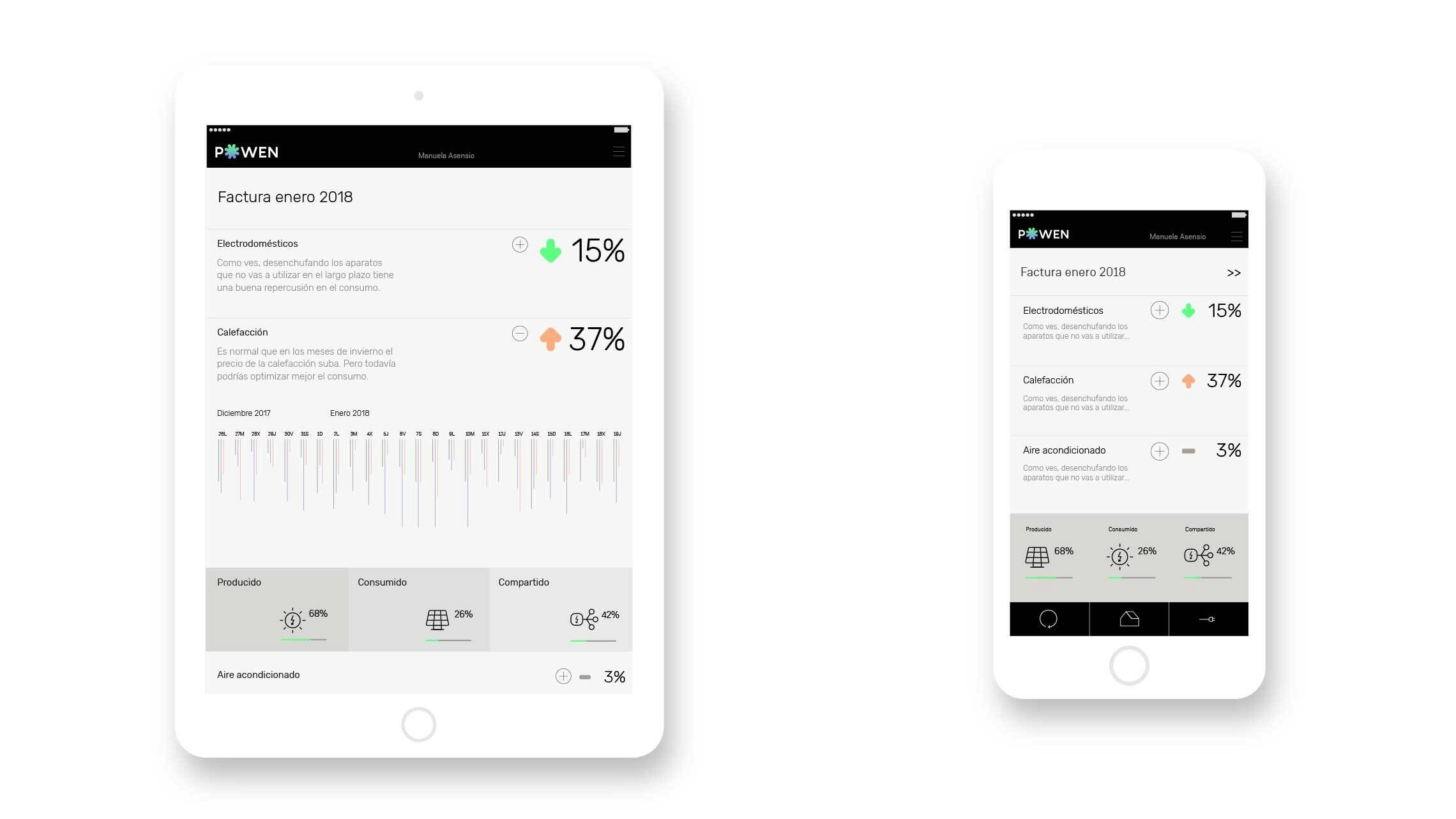
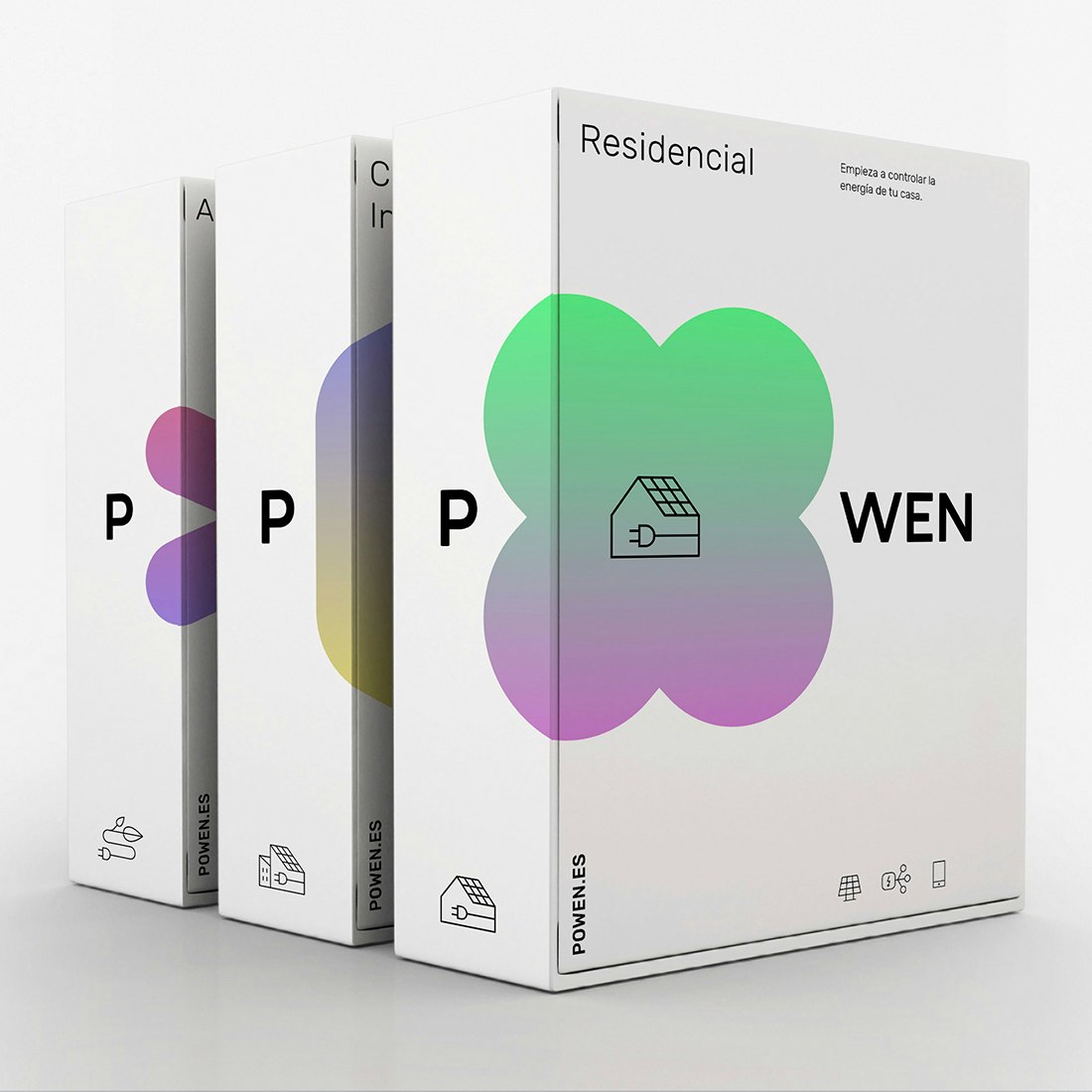
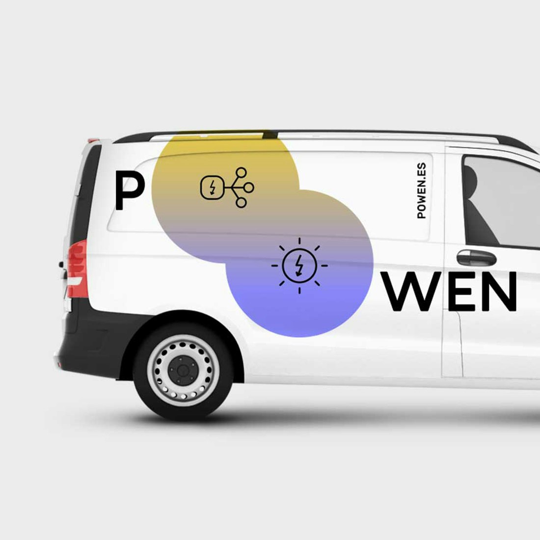
To create a visual identity based on the defined strategy, Saffron’s design team brought the logotype to life. The identity was designed to mirror the smart control panels that the company provides to empower their customers’ usage.
Energy that moves you
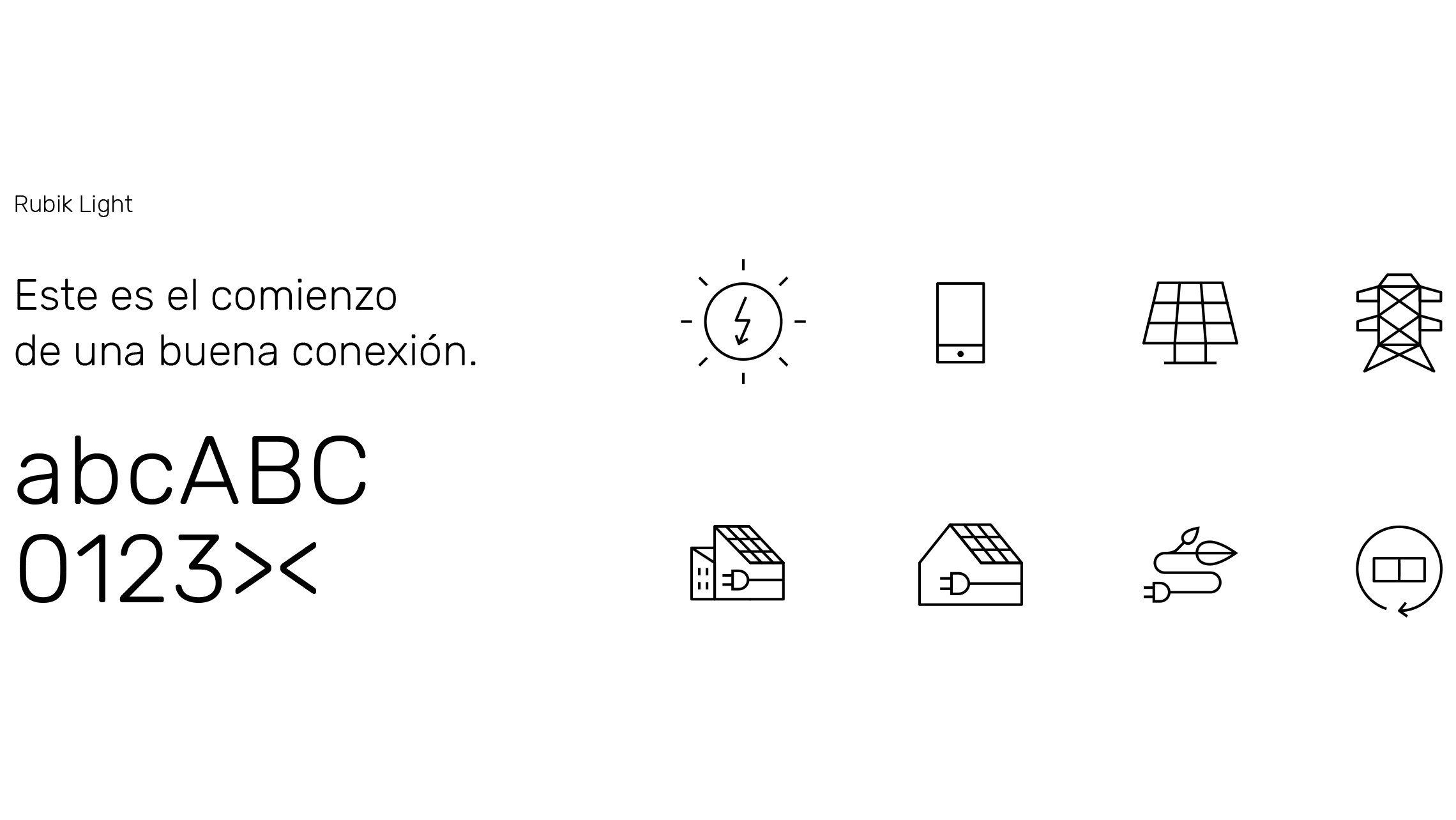
To reflect the brand’s role as an engaged educator communicating in real time, we crafted a set of malleable graphic emotions to illustrate the ever-changing state of energy. These states are enhanced by a powerful colour palette inspired in the changing colours of light throughout the day.
This was accompanied by clear typography and a system of pictograms that adapt to the needs of the business to communicate complex information in a simple way.
The combination of these elements allows the brand a visual expression that represents its mission and brand purpose, creating an open interaction between the company and the user.
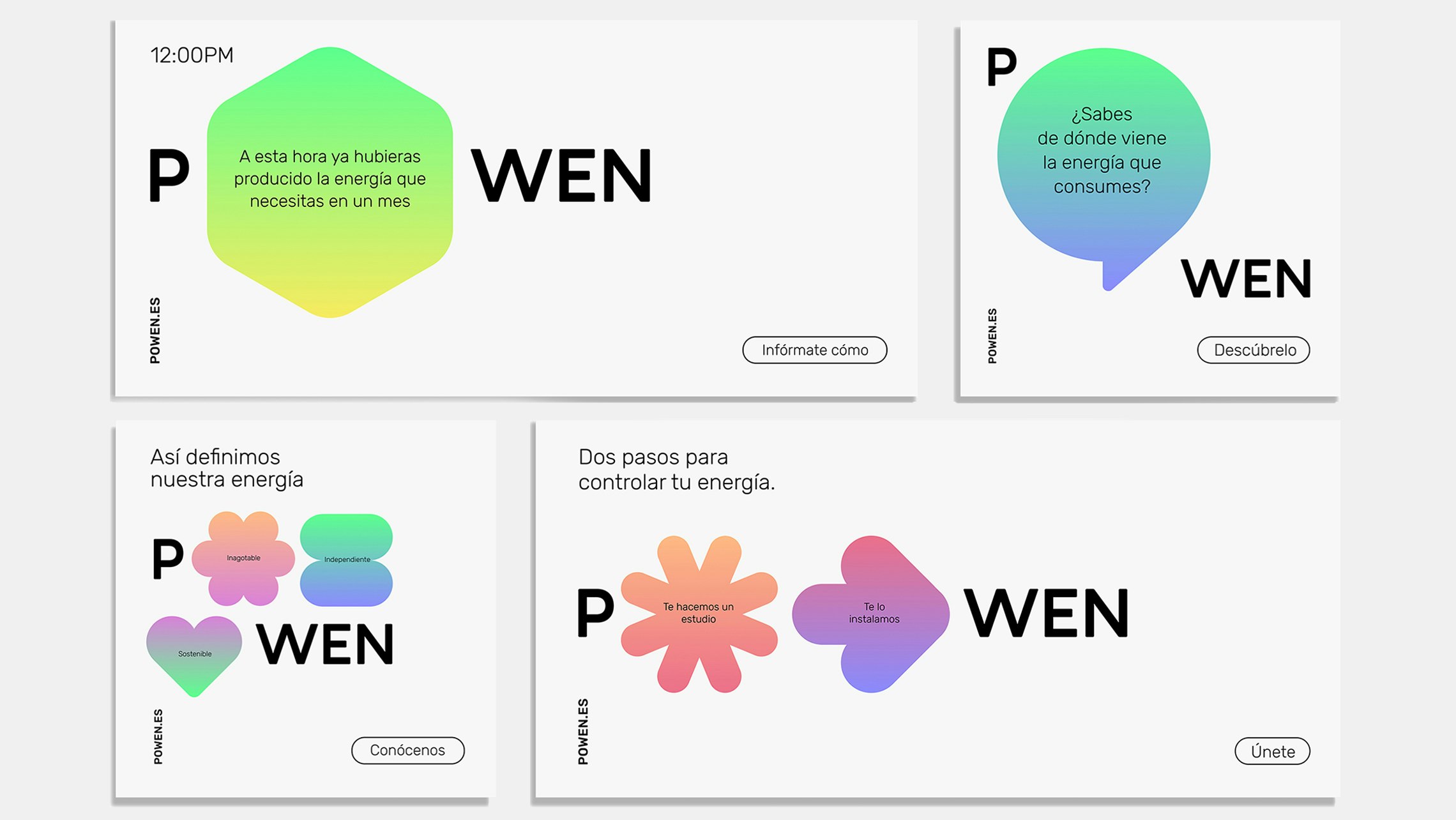
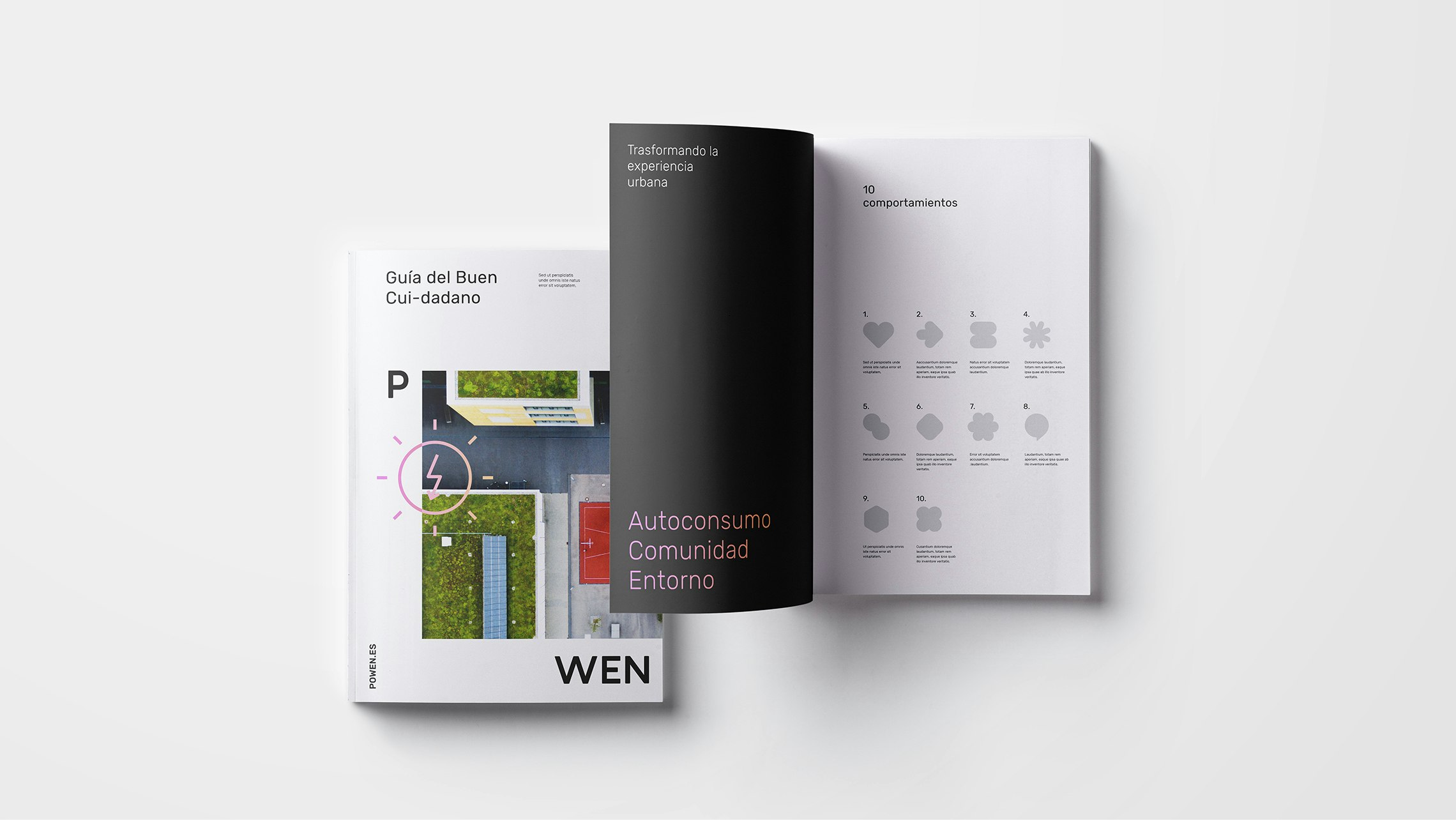
No logo
Using the “o” of Powen as the container we adapted its shapes to contain different messages, moods and symbols. No longer housed as a signature in a corner, it becomes central to the message across all communications. It provides a reminder of the ubiquitous presence of energy in the lives of customers, powering everything they do.
Our approach to the visual identity shows that brands can flex within a strong identity to reflect the company’s daily needs. In Powen’s case, this has allowed us to boost the brand’s recognition and provide them with an identity built for longevity over time.
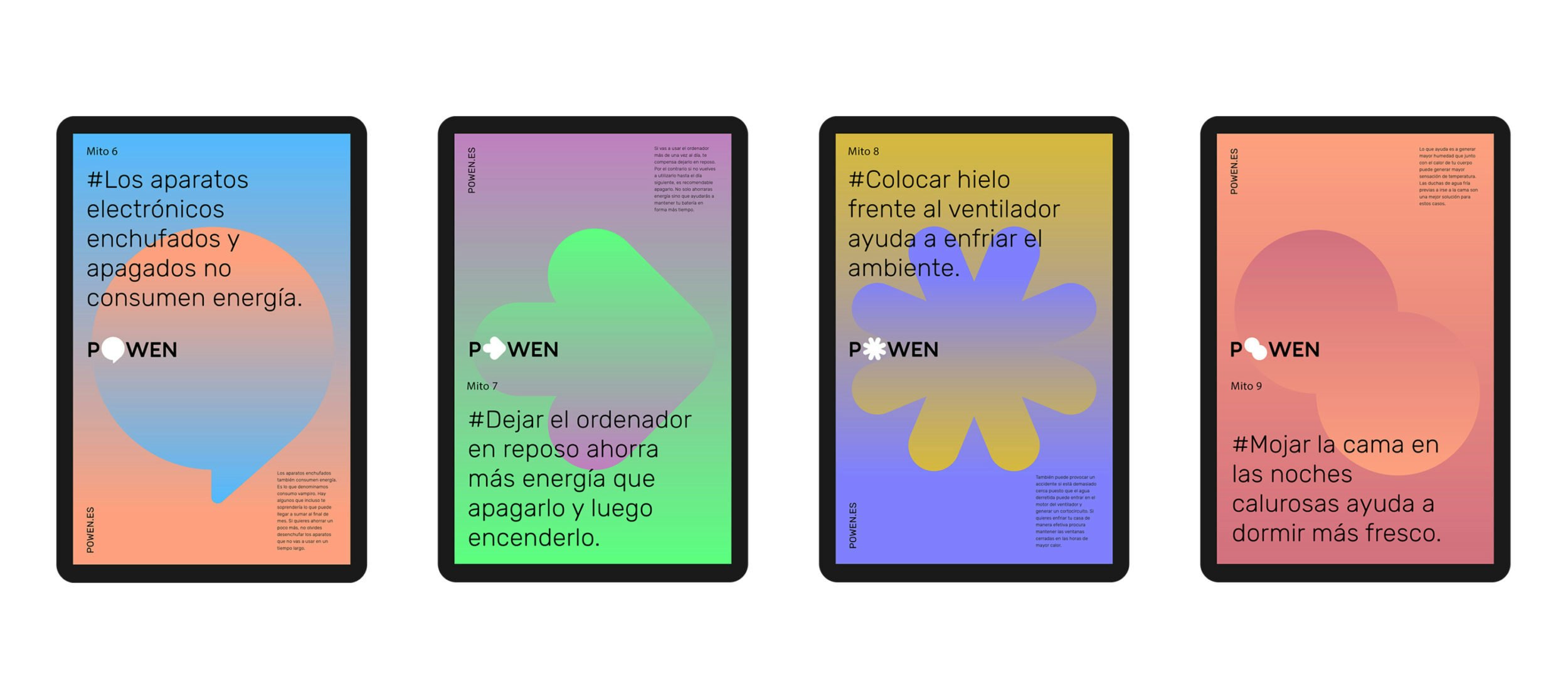
With a human-centric spirit and a drive to educate, Powen is now connecting with its customers through everyday stories, helpful hints and recommendations. They are helping people adopt new behaviours that are beneficial to them and good for society.
Awards
Our work for Powen was awarded a German Design Award 2020 for Excellence in Brand Identity.